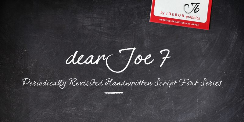
dearJoe 7 TRIAL
TrueTypeDémo
dearJoe 7 TRIAL.ttf
Mots clés
Note de l'auteur
The dearJoe series of fonts came to life around the year 1999, when I created dearJoe 1, which was a first (and half-assed) attempt to convert my own handwriting into a working font. Being able to type in my own hand had always been a childhood fantasy, and even though I only partly understood the software, a working font was generated and I decided to put it on the internet for people to use in their own personal projects.
Which they did: at this moment the dearJoe 1 font has been downloaded millions of times and can be found on Vietnamese riksjas, Tasmanian gyms and chocolate stores on 5th Avenue for instance.
The font is not something I am particularly proud of, but it started me of in building what's now the JOEBOB graphics foundry.
Inbetween creating other fonts, the dearJoe series has become a theme I revisit every once in a while, trying to create an update on how my handwriting has evolved, along with my abilities in creating fonts that mimic actual handwriting. In the last decade or so I started implementing ligatures and alternate characters, which helped a lot in coming to a result that can almost pass for actual handwriting.
The 2019 dearJoe 7 font is the latest addition to this font family.
All characters in the complete font were scanned from handwritten notes, cherrypicking the characters and letter-combinations I liked best. They were written with a Lamy M66 B pen and only minor adjustments were made to the original scans, leaving most little flaws and rough edges as they were for a convincing ball-point on paper result.
The font comes with over 150 ligatures, making sure the font has a variated and credible overall look and feel.
You can download a TRIAL version of the font here on Dafont. Please note that it comes without the ligatures and it is not printable. For a complete, working version please go to https://www.joebobgraphics.com/fonts/dearjoe-7/
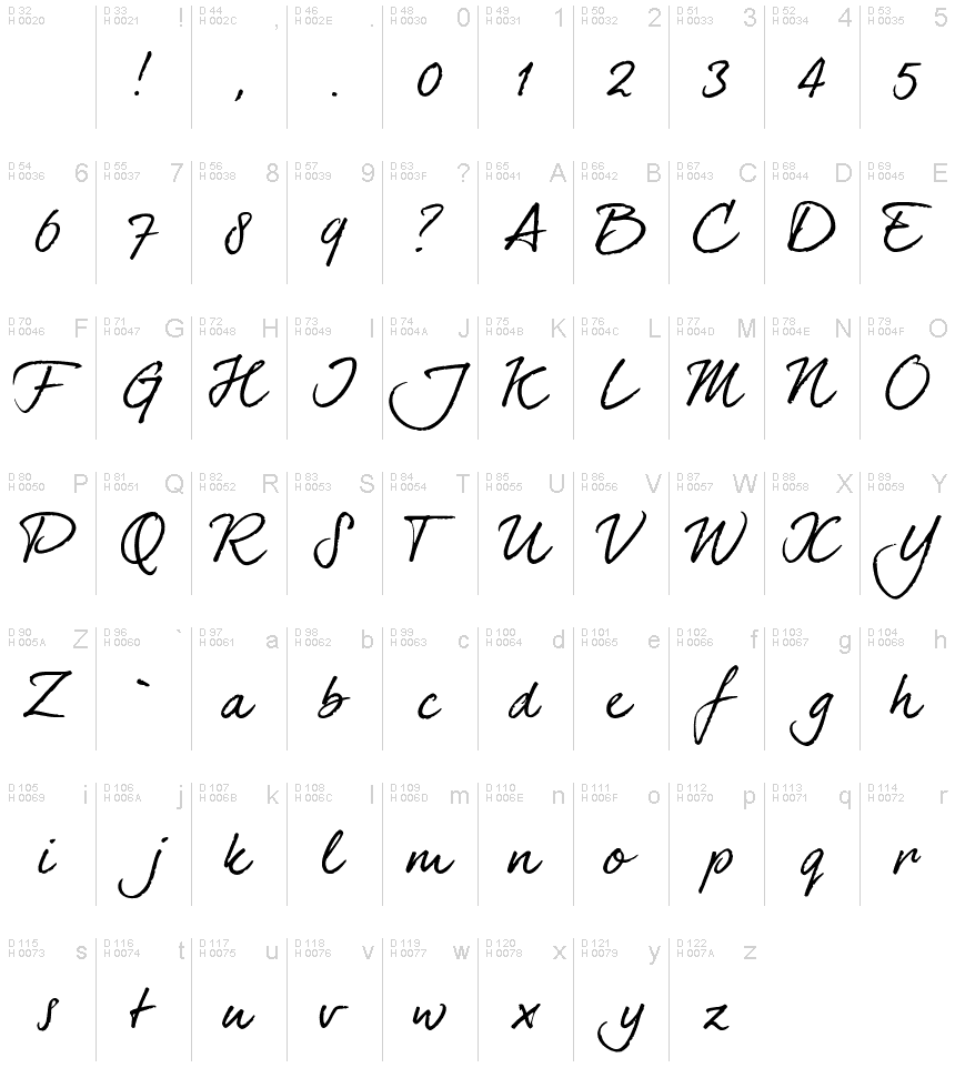
Table de caractères
Veuillez utiliser le menu déroulant pour visualiser de différents tableaux de caractères contenus dans cette police.

Informations sur les polices standards
Famille de police
dearJoe 7 TRIAL
Sous-famille de police
Regular
Identification unique de sous-famille
1.000;pyrs;dearJoe7TRIAL
Nom complet de police
dearJoe 7 TRIAL
Nom de police postscript
dearJoe7TRIAL
Nom du fabricant
Créateur
Informations sur les polices étendues
Plateformes supportées
PlateformeCodage
MicrosoftUnicode BMP uniquement
MacintoshRomain
UnicodeUnicode 2.0 et sémantique en cours, unicode BMP uniquement
Détails de la police
Créé2018-04-16
Révision1
Comptage des glyphes68
Unités par Em1000
Droits incorporationIncorporation restreinte (non autorisée)
Classe familleÉcrit
PoidsMoyen léger
LargeurMoyen (normal)
Mac styleGras
DirectionSeulement glyphes fortement gauche-à-droit + glyphes neutres
Caractéristiques des modèlesItalique
EspacementNon fixe
